.png)

 124
124
We want to ensure that there is consistency across the board for the self service help center currently referred to as the KNOWLEDGE BASE or KB. This template outlines the parameters that have been agreed upon to help guide us as we take on the task of updating the resources that already exist, as well as future articles that will be created for reference by our customers and employees alike.
Each module will have TOPICS (overviews) and then corresponding HOW TO GUIDES (step-by-step). The overviews will have links to the corresponding step-by-step articles.

Each How To Guide article will have 4 sections.
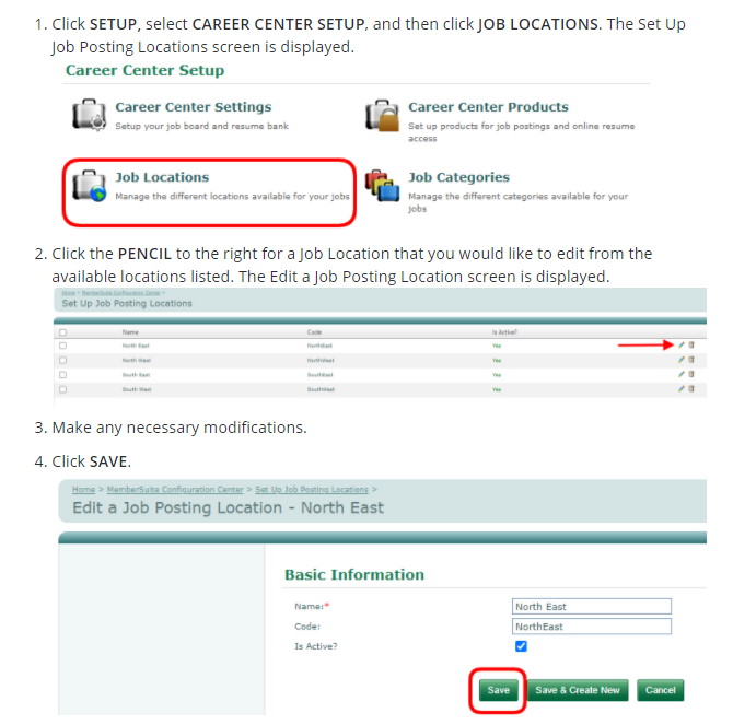
- 1-2 sentences asking the reader if they need to do what the article is instructing them to do. Example. This article is titled "Edit a Job Location".

- A step-by-step written guide with screenshots advising the user how to achieve the task.
- Each step-by-step will have a corresponding quick video using the KB Review Demo (not a customer association). ** These will need to be done during the updating process. The video must reflect the step-by-step written instructions.
- The final section has links to other related TOPICS within the CATEGORY (module), as well as a link back to the CATEGORY. In this case, the TOPICS are JOB POSTINGS and JOB CATEGORIES and the CATEGORY is CAREER CENTERS.

Here are the specs to keep all articles looking cohesive.
PARAGRAPH: All writing/words will be in the PARAGRAPH format with a font size of DEFAULT and the default system color, which is BLACK.


TITLE: The how to article only needs the actionable item in it. Example: Edit a Job Location.
STEP-BY-STEP WORDING: Each actionable item should be ALL CAPS and BOLD. See step 1 in this example: https://help.production.membersuite.com/hc/en-us/articles/115001920363-Edit-a-Job-Location
GRAPHICS: Within the steps, it is helpful for the readers to have a corresponding visual to help guide them. If there is a logical graphic that can provide context to the reader for where they will find the area they need to click or hover over, it should be included. When doing screenshots, be sure you are in the KB Review Demo, NOT in a sandbox. We don't want the yellow bar at the top. The KB Review Demo does not have customer info and it is not in sandbox mode. Be sure to change out of this when done your screenshots. If you are adding data for demo purposes, please be sure that it is not made up and odd names/info. Example: John Smith, ABC Company is fine, but Sunflower Sunshine, Google, Inc. would not be. Do not use any REAL company names, especially not customers.
We will use the app NIMBUS for all graphics to stay consistent. https://nimbusweb.me/screenshot.php
Because there isn't a HEX code option, we will use the following manner to get the same shade of red for all graphics. You will move the cursor to the very TOP RIGHT CORNER (shown by the arrow). Then you move the color slide bar all the way to the TOP. Last step, is to move the opacity all the way to the RIGHT.

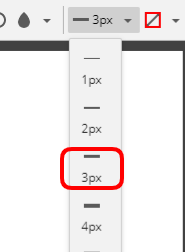
All arrows and outlines/boxes will be 3px. All outlines/boxes will be rounded edges

All graphics will be LEFT JUSTIFIED.

RIGHT HAND PANEL FOR SAVING AN ARTICLE
Be sure it has the following settings:
-
- Published vs. draft
- Managed by ADMIN and AGENTS
- Visible to EVERYONE
- Publish in section (make sure it is the correct category (module) and section (topic or how to guides)
- Make sure the OPEN FOR COMMENTS checkbox is unchecked (this was updated mid-project)
- Is the author someone currently working at MemberSuite? If not, change it to yourself or Marny Klump.
- Labels: This should not have a bunch of labels. The system pulls based on labels so if EVERY article had "howto" or "guide" in it, all would pull when people search. 2-3 at most. Labels need to be SINGLE words, so for career center, we just use career because they would pull that first.
- module (one word. the first)
- one word from article title Example: job or location
- hit SAVE often so you don't lose your work.


